Overview
This project came about because quantitative and qualitative research uncovered that the process of finding homes to buy or rent on Zillow contained too much friction and noise for users first landing on the site.
My role: Design lead
Problems:
early first-time homebuyers rarely know exactly what to do next in their home shopping process
There is a lot of noise and distraction on the homepage and users aren’t interacting with the segmentation tabs on the homepage meant to segment them into a buy or rent scenario resulting in many users landing on the search page with the wrong condition set
Users weren’t filtering the for the most important criteria when they landed on the search results page (research uncovered that this was likely a combination of fear of missing out on homes, a lack of discoverability and a lack of understanding on what the users own criteria really was
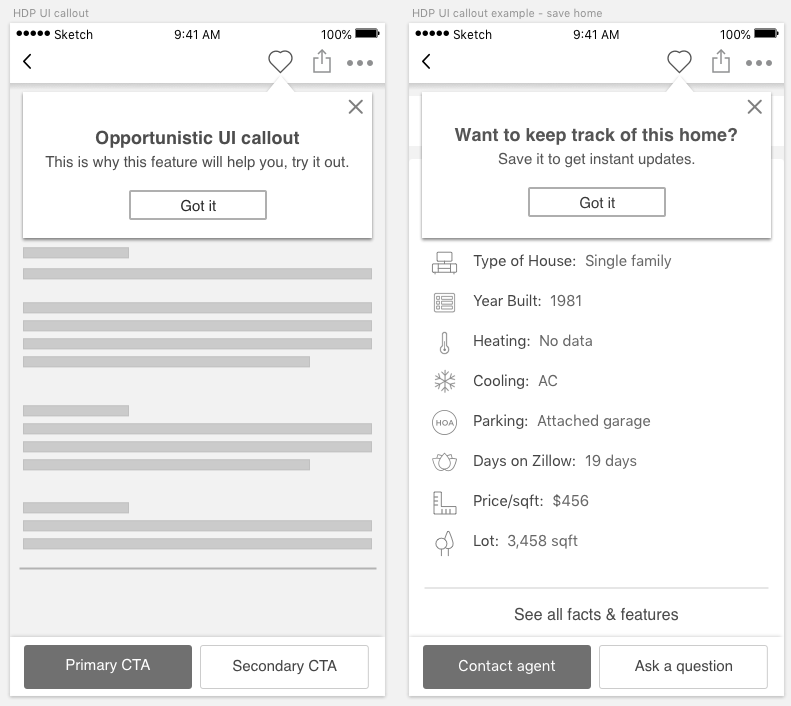
Once users landed on homes they cared about they were rarely interacting with options which would help them keep track of their homes (save, share etc)
Solution Hypothesis: Reducing noise and introducing accelerators will help users find homes which match their criteria more quickly and result in a higher quality experience.
Goal: Create a flexible system which will allow us to use a mixture of logic and machine learning to help users find their dream home quickly and efficiently.
Design Tenets:
Helpful, timely and relevant - when her incentives are tightly aligned and the signal is high
Not something that she learns to ignore
Shouldn’t feel like an ad or be in danger of banner blindness
Design Sprint
I partnered with my product manager to run a 3-day design sprint to align valuable stakeholders and generate solutions
Low Fidelity Mocks
Next I created multiple variations of important flows in low-fidelity to review with stakeholders
Framework
This was meant to be used as a system which could be built upon so it was important to define rules around how these components should be used
Example Flow
This system was meant to flex with the user so there isn’t one set flow. This mid-fidelity flow is an example of what could happen in one specific scenario.
Validation
In order to validate parts of the flow, a user researcher tested a clickable prototype with users
Final Designs
As of July 2019 final designs are still being rolled out slowly to production in A/B tests


