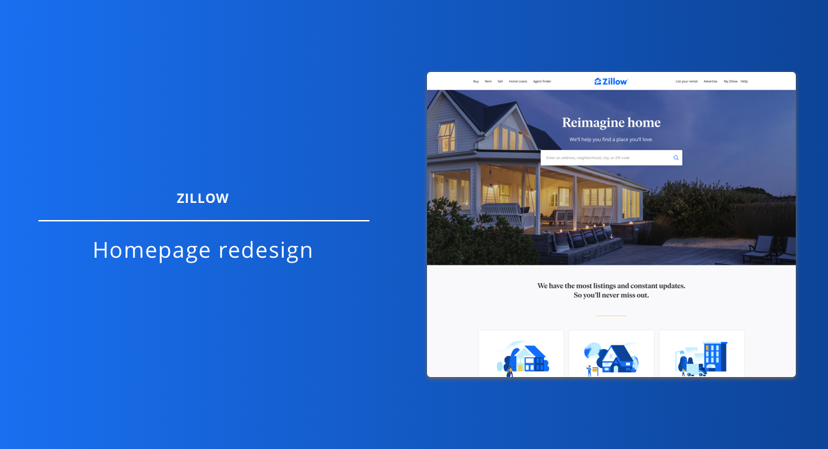
Overview
Zillow’s homepage had been redesigned many times since it launched in 2004 but quantitative data indicated that not only was bounce high, a heuristic evaluation uncovered issues such as actions with variable outcomes, distracting pop-overs and the fact that there was a total of 22 different options for a user to click on.
My role: UX lead. I also worked very closely with our design systems manager who was leading efforts on a unified header.
Problem: Homebuyers and renters were bouncing from the homepage at a high rate.
Hypothesis: By reducing noise and simplifying the design to highlight the most valuable entry-points, users would find homes they were looking for more easily and would convert at a higher-rate.
Concepts
Initial wireframe concepts stripped everything but the essential home shopping flow and moved all other navigation behind a hamburger menu.
In addition, I explored concepts such as personalized homepages based on past visits or pre-filled search boxes based on traffic source.
Validation
The initial prototype was tested via remote usability testing to validate that the simplified homepage would allow users to quickly take the next step in their shopping journey.
In addition to removing links, the tabbed segmentation was also removed so another solution to help users choose which type of home they were looking for was needed.
Overall the testing validated that the new design was very usable for new users looking for homes on Zillow.
Navigation
While the prototype was successful in allowing users to begin searching for a home, the navigation was too hidden and users didn’t find other important Zillow offerings right away when prompted. This meant that some important navigation elements needed to be added back in.
Final designs
Final imagery and font choices were delivered in partnership with the Zillow Design Systems team.


